2014 Upper Shore Creel Project Results
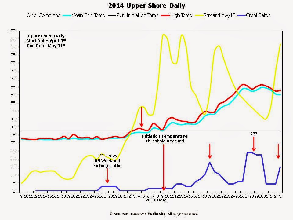
2014 Upper Shore Daily
Trends
April 26th and 27th was our first weekend of heavy Upper Shore fishing traffic based on various reports, and catch rates of fish in the streams increased accordingly; and while numbers were low, the reported fish were all steelhead.
On May 4th, daily high stream temperatures hit the low 40°F mark and stayed there although average daily temps remained in the 35°F-37°F range. This appears to have triggered some activity although temperatures did not maintain above the initiation threshold until May 9th. Throughout this period, flows were very high, likely above the limiting flow threshold. Although it is not flagged, you can see a bump in the catch trend on the 12th and 13th as flows on our index stream dropped into the 800cfs range, Again this suggests that the limiting flow threshold for up bound movement there is right around the 800cfs mark
By May 25th, flows had again dropped below the 800cfs range and catch increased significantly. These were likely new adult fish taking advantage of the dropping flow to begin their upstream migration and the numbers were quite high. I put question marks there simply because we don’t see this kind of spike with a flattened peak very often and suggests a sustained run of fish for several days.
By June 1st, flow-values were climbing again due to precipitation with the catch trend falling correspondingly. We’re still a little unsure as to why there was the spike in trend on June 3rd given flow values were so high. You have to remember that each region of the Shore is fairly broad geographically, but we are typically using a single index stream within each. While you can use these streams to infer conditions on other streams in the area, it could simply be that this precipitation event was highly localized, and that fishing conditions were much better elsewhere in the Upper Shore region.
One last note regarding the Upper Shore creel: We know from other reports that fishing remained decent for another 10-14 days after our creel reports stopped coming. We encourage you all to continue reporting catch whenever possible as this helps us to flesh out the entire picture. The tail-end of the Upper Shore runs are a little data-poor in particular, so whatever you care to send is greatly appreciated!


We use the daily trends as our primary means of:
- Looking at pre-run conditions
- Assessing when significant upstream migration is likely or about to occur
- As a way of illustrating all of the granular interactions between the fish, the flow and the temperature on a daily basis.
Note the red arrows at various points on each chart, these will
be discussed, and each point will be noted by a corresponding text highlight at
the start of the paragraph. In other words simply jump from the discussion to
the chart, find the corresponding date, look at the humps and bumps in the data
Annually, once we start seeing signs of ice-pack movement on
index streams in February and/or March, we begin tracking the stream temps. As
Creel reports start rolling in, we track those trends against the daily
temperature and flow values which results in the Daily chart below.
2014 Upper Shore tracking began in early April with the first creel
reports coming on until April 12th; apparently this was a popular
date all across the Shore. These were all early fish comprised solely of
steelhead.
April 26th and 27th was our first weekend of heavy Upper Shore fishing traffic based on various reports, and catch rates of fish in the streams increased accordingly; and while numbers were low, the reported fish were all steelhead.
On May 4th, daily high stream temperatures hit the low 40°F mark and stayed there although average daily temps remained in the 35°F-37°F range. This appears to have triggered some activity although temperatures did not maintain above the initiation threshold until May 9th. Throughout this period, flows were very high, likely above the limiting flow threshold. Although it is not flagged, you can see a bump in the catch trend on the 12th and 13th as flows on our index stream dropped into the 800cfs range, Again this suggests that the limiting flow threshold for up bound movement there is right around the 800cfs mark
On May 15th and 16th, flows
decreased below the 800cfs range and catch rates increased dramatically until
the 19th when a precipitation event again spiked flows. Catch trends
decreased through the 24th as flows remained high.
By May 25th, flows had again dropped below the 800cfs range and catch increased significantly. These were likely new adult fish taking advantage of the dropping flow to begin their upstream migration and the numbers were quite high. I put question marks there simply because we don’t see this kind of spike with a flattened peak very often and suggests a sustained run of fish for several days.
By June 1st, flow-values were climbing again due to precipitation with the catch trend falling correspondingly. We’re still a little unsure as to why there was the spike in trend on June 3rd given flow values were so high. You have to remember that each region of the Shore is fairly broad geographically, but we are typically using a single index stream within each. While you can use these streams to infer conditions on other streams in the area, it could simply be that this precipitation event was highly localized, and that fishing conditions were much better elsewhere in the Upper Shore region.
One last note regarding the Upper Shore creel: We know from other reports that fishing remained decent for another 10-14 days after our creel reports stopped coming. We encourage you all to continue reporting catch whenever possible as this helps us to flesh out the entire picture. The tail-end of the Upper Shore runs are a little data-poor in particular, so whatever you care to send is greatly appreciated!
2014 Mid Shore Weekly
Averages
We use the weekly averages to:
- Illustrate average flow, temperature and creel catch for each week during "The Run"
- Filter out the "noise" in the daily charts in a way that is more intuitive to see and understand
- Illustrate fish movement post-ice-out, pre-initiation and post initiation
- Illustrate the overall current-year run picture for each Region of the Shore: Lower, Middle and Upper
- Use each year's weekly average to produce a historical run picture for all the years we have data, the "Big Picture"
Full ice-out occurred in very early April. Following May 11th
when the initiation temperature threshold was met, catch trends for both
steelhead and Kamloops increase, but as with the Mid Shore, you can see the probable
suppression of up bound movement due to the average flows most likely being
above the limiting value for the week of May 7th. As flow values drop, we see
peak creel occurring the week of May 21st. Both Mid and Upper Shore kamloops
numbers remain low. This illustrates the effectiveness of the Minnesota DNR’s
kamloop stocking methodology. While there clearly is some straying occurring,
limiting stocking of kamloops to Lower Shore locations with the goal of
reducing genetic introgression (kamloop-steelhead cross-breeding) appears to be
working given the low numbers returning to creelin each of these two regions.
Historical Upper Shore
Creel Data as of 2014
We use historical creel numbers to:
- Paint the "Big Picture" of returns to creel over the long term
In the simplest terms, the historical data illustrates the
earliest and latest dates fish have (reportedly) run for each region of the
shore. While it's not a crystal ball by any stretch of the imagination, it does
give you a framework for when to expect things to happen from year to year.
Given enough time and data, what you also see are some well defined markers for
peak returns. All we do here is to smoosh all of the annual data we capture for
each region of the shore into a unified historical picture.
As of 2014, we still don't have enough data for this to be illustrated with any
clarity. The Upper Shore is probably the one region where we have a somewhat
accurate picture – at least for now. The one caveat being that we are still
data-poor on the tail end of the runs for this region which is why you see such
a significant decrease as things move into June. Lastly, the whole point of the
historical chart is to present a one-stop shop for:
- When do things typically start
- When do things typically peak
- How long does it typically last
- When do things typically end
Historical Upper Shore
Run Progression as of 2014
We run progression numbers to:
- Illustrate
and define what the theoretical run progression is with respect to up
bound movement in adult fish
The Historical means show you what to expect in any given year
as you look forward. The annual creel and trap validate ideas regarding
initiation temps and are the basis for other information. The Daily data shows
flow, temps and their affects on fish movement. It also gives you a very good
indicator of what is occurring and what is about to happen locally in any given
year. The progression is a planning tool for you to use to position yourself to
be a more effective North Shore Steelheader. Upper Shore appears to be different than Lower and Middle at first glance, but you can read why we think it looks this way here:

More Project data on the way. Special thanks to the Minnesota DNR
Fisheries Section and Don Schreiner; Good Luck Don!
Regards-
NMF and Minnesota Steelheader


Comments