2015 Creel Project Results
 A Little bit about the Creel Project and how we prepare the data:
Each year since 2010, Minnesota Steelheader has asked anglers for voluntary catch reporting of Steelhead, Kamloops, and what are presumed to be Coaster Brook Trout, caught in the tributaries during the Spring migration. We collect those reports along with daily flow, temperature and other open-source data, then run them through an app we created. The results are subsequently plotted in Daily, Weekly and Historical formats in what we hope are intuitive and easy to use charts.
This is not a scientific creel by definition, but we do try to use and present as much of the available scientific literature as we can in the context of the charts with the goal of better understanding these various species. The information is presented to you for your consideration in the hope you'll find it useful.
A long time ago, we began with the premise of Informing, Educating, Entertaining and Inspiring both veterans and new-comers alike. The Creel Project looks to answer some of the most basic questions we receive year after year:
- When do the fish run?
- How long does the run last?
- When is the "best" time to go and how might I plan, particularly if I have to travel long distances and only get one or two opportunities to get out and fish each year?
- Are there differences between the various regions of the North Shore?
- How does flow and temperature affect overall fishing and presentations?
- What is the overall picture of runs across the North Shore?
- Daily reported creel is plotted against both flow and temperatures to help visualize some of the more granular interactions between fish and the various environmental factors
- The daily numbers are then plotted in a weekly format which removes a lot of the noise, and helps to visualize the overall progression of the current-year's run
- The weekly numbers are finally nested within all of the previous year's of data we have to create a unified historical picture

2015 Creel Project Results

Lower Shore
I think one of the things which struck us about this year's run was that we had fish around for a significant length of time. We still need to run some prior-year comparisons, but we had good reports on the lower shore for in excess of 40 days. Not only that but the overall numbers of steelhead reported made this a run to remember.
As with virtually all previous creel regions and years, initial upstream migrations occurred at the point the average stream temperatures reached what we call the initiation threshold. DNR literature for the north shore discusses this concept (although they don't use this term), and while it's slightly more complicated than what we present, the basic threshold occurs when average daily water temperatures reach and maintain 38° F. This year it was a little tougher to nail down because our normal temperature index stream isn't transmitting. Our fallback package is on a very small stream which tends to hit the threshold several days up to a week prior to larger streams such as the Knife. This is the primary reason you see a nearly five day delay between posted init threshold temps, and strong initial returns reported in the creel.
Other items of note in the daily here are the drop in trend corresponding to the high flows between the 10th and 12th of May. We know based on the literature that up-bound migration effectively ceases when flow reaches certain thresholds. This is of course different on each stream, but we also know from the literature that this threshold on the Knife falls roughly in the 500cfs range. Because Knife flow is an indicator of what other streams are doing with respect to flow, flows exceeding 500cfs likely mean that other streams closely located geographically are also close to, or above their own thresholds. While this doesn't mean there are no fish to be had, it does change their behavior, and how you need to approach steelheading e.g.: Fishing smaller streams, fishing sheltered locations, fishing big bright, or big dark and smelly presentations.
We are also beginning to pay attention to daily average stream temperatures on the tail end of the run. While we can't say for sure, the developing picture seems to be that once those average temps reach somewhere in the 55-56° F range, the fish seem to raise the white flag and call it quits for the year, even when we get a good bump in flow subsequent to that point. Ordinarily, once the daily average temps hit and maintain the threshold and initial up-bound migration begins, flow appears to take over as the primary influence on subsequent returns and up-bound migration. Don't however confuse this with how daily temperatures affect where already-present fish are locating in the stream, and how active they are on a day to day basis. That's a different concept and covered in other blog articles.

The weekly illustrates how the lower shore run progressed over time. This is a very typical picture we see year after year: Heavy initial migration subsequent to the threshold being attained lasting for roughly 10-12 days, followed by decreasing catch over a several week period. While the daily chart only illustrates overall catch trends and not actual numbers caught, the weekly shows the actual catch numbers reported for both species in a weekly format.
If you compare the weekly catch for steelhead against the daily chart flow, you can see how high flows towards the end of the week of May 7th decreased steelhead catch. The reason kamloops catch doesn't seem to be consistent with that is that when we looked at the data, reported catch virtually ceased until the 12th when flows were dropping back into the 240-380cfs range. So many kamloops were caught on day 7 of that week that it affected the data-point, appearing to give you a peak during that May 7th week.

We now have enough annual data to begin putting together a pretty good picture of the lower shore run. The lower shore historical means illustrate the average numbers of rainbows reported by week for all years in the Creel Project. Over time, this picture will become clearer, but even now you can see a definite average peak developing. Generally speaking we are reporting an average of 70 rainbows the week of April 16th over the 6 years of the Creel Project. This closely agrees with, and is supported by DNR trap numbers. Currently the date with the greatest numbers of rainbows sampled over time at the trap has been April 18th. The practical application then is that if you are trying to plan a trip for any given year, April 16th through the 22nd becomes your starting point. If you were a bookie, that would be your money-week, but we all know that year to year fluctuations in weather, flow and temps means that understanding where the initiation threshold falls allows you to dial in even tighter.

The All-Time chart also shows you the overall picture for lower shore. The difference here being that we plot the total number of fish creel-reported by week. The overall sample size (N=1959) means the sample size is 1,959 rainbows total in the creel.
Generally we see that the earliest ever reported fish came the week of March 12th, with the latest fish reported coming the week of June 4th, so this becomes your baseline for when the lower shore run potentially happens in any given year. That week of March 26th by the way was one of our earliest recorded runs, and is still playing havoc with the data. Anecdotal information also places it as an absurdly early run by anyone's recollection. Otherwise we see that strongly defined peak the week of April 16th, and a couple sub-peaks which will probably disappear with more data.

Trap Results
Finally we have lower shore trap results. This chart illustrates the publicly-reported numbers of both steelhead and kamloops from both the Knife and French River Traps. We also plotted average temps and the actual average flow for Knife River by week.
The item of note here illustrates the slight differences in steelhead and kamloops. Kamloops exhibit a slightly lower run and spawning temperature than steelhead. Generally, you can treat the initiation temps as the same for fishing purposes because we aren't as concerned with the finer biological distinctions between the species when we are out there flinging spawn-bags, waxies or flies around. Just be aware that the differences are there because this can mean all the difference between fishing and catching, especially in cold water on the front-end of the runs.

All-Time Knife Trap numbers. There are a couple oddities here which don't really warrant going into. We do plot the long-term flow averages for Knife River for your consideration along with total numbers of fish sampled by week. Total sample size is 13,462 rainbows trapped.

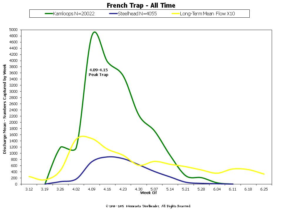
All-Time French Trap numbers. Also a couple oddities here which don't really warrant going into. We plot the long-term flow averages for Sucker River (Gage now disabled) for your consideration along with total numbers of fish sampled by week. Total sample size is 24,077 rainbows trapped.
Mid Shore
This one is a bit of a cipher. We see the initiation threshold reached on the 14th with creel trend increasing almost immediately, but then we took the temperature dipsy-doodle. However once we re-attained and maintained the threshold, trend immediately took off again. The other thing is that the mid shore launched at virtually the same time as lower shore. Looking at historical data, it's been about a 50/50 proposition as to whether the mid shore kicks off at the same time as lower shore. We think that much of this (seeming) lack of variation has to do with the fact that most fish-able mid shore tribs are marginally smaller than their lower shore counterparts, and tend to warm a little faster putting them roughly on the same schedule more often than not. It would be interesting to study just the Baptism in this context, but our Creel Project isn't set up this way.

All lower shore/mid shore migration start date arguments aside, we do see a definite difference in the creel peaks between the two regions of roughly a week. Same end-of-run picture emerging regarding things winding down when average stream temps reach that 55-56° F range.

Once again, the historical mid shore means are, odd... Data is still all over the place but with time we should develop a pretty solid picture of what the mid shore tends to do from year to year.

Mid shore All Time, same comments as the means...

Upper Shore
Very little difference here with the initiation threshold, roughly two-days difference between mid shore on the 14th and upper shore on the 16th. After the threshold is reached, creel trend increases almost immediately, but here again we took the temperature dipsy-doodle. On re-attaining and maintaining the threshold, trend immediately takes off again.

Here we have a bit of an extended peak in creel. Fishing on the upper shore was very good during that roughly two-week period.

Still trying to figure out what the overall upper shore picture looks like. One of our biggest problems is lack of good data on the back-side of the upper shore run. The chart might lead you to believe that fishing drops off precipitously during the first week of June. The problem is we just don't have enough data to have any meaningful insight into how long things last on the upper shore. It one of the reasons we consistently request reports for that region and time period specifically year after year.

Same concept here: lower weekly all-time numbers by week due to less people fishing the upper shore along with lack of data on the back-end.

Shore-wide Historical Creel Survey
The Shore-Wide Historical represents the unified picture for all regions of the shore: Start, peaks, end and average numbers of fish reported by week. It's the "big picture" chart.

Same concept here representing the unified picture for all regions of the shore: Start, peaks and end. The difference between this and the preceding chart being it contains total numbers of fish reported by week. Again, a "big picture" chart.

Coasters and Steelhead
This is an interesting little by-product of the creel project. We were curious about brook trout (presumed to be coasters) reported during the spring creel. We know that coho for instance, are frequently taken close to shore in the spring, and the prevailing thought is that they are there feeding on smelt which are staging for their own runs.We also observe the same apparent type of behavior in the brook trout during fall. Historical accounts of "Rock Trout" staging near-shore and being caught by anglers as early as July were frequent, but this was during the pre-pink salmon era. Contemporary reports frequently associate presumed coasters with pink runs. We think the fish are taking advantage of an abundance of free-drifting eggs from spawning pinks as a food source. This is probably a good strategy given the rigors of spawning taking place later in the fall among coasters. Pack on the pounds, get fat and healthy to better survive spawning, that kind of thing.
At any rate, since these fish are making their living in and around near-shore habitat, it would make sense for them from a survival-strategy standpoint, if they took advantage of other species in a similar fashion, and we are beginning to think steelhead offer them just such an opportunity.
When we looked at our coaster data, we saw a signature in that creel data which looked awfully familiar:

So we plotted the coaster data against the shore-wide historical rainbow data, and while we don't get an exact match, it does get more interesting.

When we looked at the specific historical peaks for each region, and then plotted the coaster peaks in reported catch as a function of date, that pretty much was an exact match. We also know that prevalence of coasters in the creel is much higher for the mid and upper shore which may (or may not) lend some insight into coaster populations and densities.
One quick note about that "early" peak depicted below. For the year in question, pretty much the entire shore launched at the same time, and catch rates were relatively high for all species, including coasters.

The last item to note is that we are not using this coaster data for fishing purposes. It has however become a way to use a seemingly unrelated type of data to understand more about the steelhead. If the premise holds true, and coasters are taking advantage of free-drifting steelhead eggs as just another high-value food source, it would make sense that coaster catch might correlate with peaks in steelhead returns. Or maybe it's just a fluke, only time will tell.
MS Creel Project Raw Numbers by Year
And last but not least, our raw creel numbers for each species by year.

We at Minnesota Steelheader hope you find something in this information useful. So from all of us, a great, BIG thank you! Without your participation, none of this is possible.
Best Regards-
Minnesota Steelheader


Comments