Building the Historical Context
The last thing we do as part of building the Creel Project framework, is to nest all of the regional data into what you might think of as a historical picture for the runs along the entire North Shore.
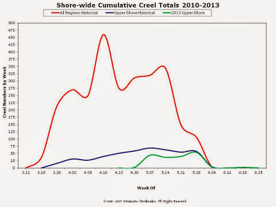

Shorewide Snapshot

What you see here is a sort of visual representation of the data nesting. The green line is the actual 2013 Upper Shore Creel Project data. This was combined with the 2010, 2011 and 2012 Upper Shore Creel Project data to create the blue line. The blue line represents all of the historical data for the Upper Shore Region. This is in turn combined with the Lower and Middle Shore historical data to create the red line for a unified historical snapshot of the entire North Shore.
Over time, a picture should develop for each region as well as the entire Shore. This should allow us to begin answering questions people ask about fishing North Shore Steelhead. It should also allow you to look at all of the posted data to draw conclusions about what you want to do and when.
Of course, this is an over simplification of what's represented. Although it's not a scientific creel, we do vett the creel data against as much of the specific Minnesota scientific literature as we can find. It's important to us to provide you the best information possible, which is why we also compare what we collect in the context of the flow and temperature data from mutliple sources, including that of our Great Lakes neighbors. We also look very closely at the trap data. This helps us to better incorporate what is currently known about all of those flow and temperature interactions with the fish to gain a better understanding of runs in a given year.
Latest Shorewide Historical Picture

So we're back to where this all started just a short while back. Red line illustrates the cumulative creel numbers. The blue line is there to give you a feel for the average creel sample size being collected in a given year. We're hoping this continues to increase as participation grows. Couple things about the chart: Earliest in-stream data (fish caught and reported) collected week of March 12th. This was the result of an anecdotal "early" run. Latest in-stream data collected the week of June 25th. Here we're not so sure whether this is the result of an anecdotal "late" run, or if we simply have fish in the tribs that late on average; again, only time and data will tell.
O.k. I know, some of you are asking, "What does all this gobble-de-gook mean for the average steelheader?" We're getting there; bear with us. We had to lay the foundation because we want you to be confident we aren't just blowing smoke out our... well, you know, hind ends so to speak.
Regards-
NMF


Comments